Tuesday, February 10, 2009

Best of the Web, Worst of the Web

For this post I'm going to do something slightly different. I'm going to pick a theme, and my theme is this: local nonprofits and government websites. I'm choosing to evaluate these websites in particular because theoretically they should be the easiest to navigate, with good architecture, content, and simple design. However, in my past life as a researcher and southeast Michigan enthusiast I have found that this is unfortunately not the case.

(above is a screen shot of the Michigan Suburbs Alliance homepage)

I suspect this is mainly a function of the challenges facing city government. i.e. Their resources are scarce, the staff is older (as in the staff doesn't use/care about the internet as much as they should), and existing bureaucracy promotes the attitude that it's simply better to come into the office and get things taken care of there. I'm not saying this is always true, but the majority of small city websites I've visited are not very helpful, and would make my designer friends cringe/offer to fix them pro-bono. That being said, let's check out some websites:

My pick for the best is the Michigan Suburbs Alliance
website. The Suburbs Alliance is a nonprofit based out of Ferndale Michigan that coordinates public policy initiatives among 31 inner ring suburbs in southeast Michigan, in solidarity with the city of Detroit. The content of the website is fantastic and easy to absorb, making local policy challenges seem interesting—something worth getting involved in.

(Below is a screenshot of the City of Hamtramck' s homepage)


The architecture and design of the website support the content. The website looks good, and it has high accessibility,so finding documents, publications, and more information is easy to do. I also like that the website directs you to the right person to e-mail questions to. Need a copy of publication? e-mail Anna. Questions about MMC? e-mail Sharon. This makes it so that people visiting the website that want more information receive effective feedback and want to re-visit the website.

Looking at this website, it's pretty obvious that a lot of time and consideration has gone into the content, architecture, and design. While the Suburbs Alliance is a nonprofit, it's a nonprofit that understands the importance of good design and branding. I think there's a lesson in this: namely, content + architecture + design helps visitors to the website, but also boosts legitimacy. Looking at this website, I already think that the organization must be doing good work since even the website is well-maintained. That being said, let's look at some city websites.

I'm going to pick three, because to me this is a theme for local websites, and not something that can be blamed on just one poorly designed municipal website. Hamtramck, Huntington Woods, and Ferndale. On the surface, the architecture for these websites doesn't look all that bad. However, as soon as you need something specific, like the number for a program coordinator navigation can become a nightmare. That is because there is a disconnect between what the websites want to do, and what they actually do. In reality they are not always functional.

Also, the content doesn't always seem in sync. While the Suburbs Alliance website seemed to have a uniform voice, the content in these municipal websites seems to shift and change, but not in a good way. Finally, the websites suffer from overall poor design. The Hamtramck site, for instance, makes the city look dull and kitschy, whereas in reality Hamtramck is one of the coolest communities in southeast Michigan. i.e. The website is a disservice to the community.

What I hope to have shown from this exercise is that we need to rethink municipal websites so that they can better service the community, and help to positively portray opportunities and programs in said communities. I think this may get better as the older city staff begins to retire and a new generation of workers takes their place (in the next 5-10 years).

Well, that's it for now. Go visit Hamtramck—SSS

P.S. I'm going to be at a writing workshop in NYC this weekend, with staff members from The Nation and Polito coming to teach us writing skills... as in blogging. I'll be sure to report back to the class!

Images:

Screenshot: Michigan Suburbs Alliance webpage
Screenshot:City of Hamtramck Webpage

Monday, February 2, 2009

SSSelebrity

This is me. When I wear these glasses, I've been told I look like Enid from Ghost World.

I really like Ghost World, so generally I welcome the comparison.


Last year for Halloween I was Frida Kahlo. Interesting fact: I've been her for Halloween more than once, and always buy reproductions of her paintings when I go to Mexican town in Detroit.


I don't actually look like her, but no one has ever mistaken my costume for someone else.


This comparison though, was surprising: Last week at the dentist office, the dental hygienist told me that as a child, I looked exactly like a real life "Dora the Explorer". This made me jealous, because I really wish I could speak Spanish, and have a show on PBS.


As I've gotten older though, I've lost the Dora appeal. As a freshman living in East Quad, I was often told I looked like Ugly Betty. This was in part because I constantly walked the halls in sweatpants, stressed out and wearing my glasses.

Not that there's anything wrong with looking like Betty—I think America Ferrara is gorgeous.


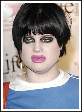
During my more portly/punk/looking stupid years in high school, I was told that I highly resembled Kelly Osbourne. This once happened at a MUN conference, to which I replied, so very un-diplomatically, that he could go "fuck himself".


Of course, what I should have done was try to wash out that awful black hair dye.


Last year, the day this photo was taken, my Uncle Leon, who works as a black jack dealer, brought a "lady friend" to our house for Thanksgiving. Said lady friend arrived drunk, and kept repeating that I looked just like Marie Osmond. Best. Thanksgiving. Ever.

Visual Argument Breakdown:

I thought this post was fun to do, since I choose a topic that was personal. In fact, I've always wanted to do a visual comparison between myself and people that I allegedly look like. I think what was hard about making the visual argument was that I felt that I didn't have much control over the order of the pictures—It was post or perish. Also, when I was finding the images, I had to look for ones that had similarities to photos of myself from my i-photo library, which was not always easy to do. Other than that, I really liked using pictures and less text, because I felt that the post was more true to something that I would actually read. To see the original photos of Kelly, Betty, Marie, Dora, Enid, and Frieda click on the links provided.

Monday, January 26, 2009

Blog Post #3: Blog Eval


(To the right is Perez)
To start this blog post, I'm going to stick with what I know, aka, reading perezhilton.com. I read this blog, at least three times every day, and I've done this for at least two years now. In the realm of entertainment/arts blogs, I think that Perez Hilton is unique because he has established himself, and gained credibility, through his blog. In fact, before perezhilton.com, he was just an in debt college graduate with a passion for celebrity gossip.

As for blog conventions, P-Nasty has created his own, which is one of the reasons he is such a force in the blogosphere. The format is simple. There are pictures, usually covered in white scribbles, with some text below them and a link to read further. Sometimes, when the images are really offensive, you have to click a link to read it (especially helpful if you're reading at work). The background is pink. Hot pink. If crayola renamed the color, it would have to be called Perez Hilton pink because the color has become so associated with the website.

To me, this is the only entertainment blog worth reading. After a long day sitting in class, I love to unwind by reading Perez. But, a note on the comments for Perez—they're trite, irrelevant, and thoughtless, but unlike other blogs the nature of the website doesn't make me think anything of it. Ideally they wouldn't be there, but the comments on perez don't bother me as much as comments on say—the free press website, which is a legitimate and widely read news source.


Unlike Perez, the blog "Scholars and Rogues" explores news articles in a more formal fashion, picking out interesting political stories and analyzing them. While the content of this blog is definitely engaging, I thought what was more interesting was the way that the blog had created such a vast blog roll, connecting this blog with many other blogs on the internet.

I also liked the use of a survey on the left side. While the results would obviously not be scientifically sound, the concept is neat and must be fun for regular blog readers and contributors. Perez does this too, and I often vote on the blog (yay irrelevant democracy) but with completely different subject matter, and the comment section of this blog is much better, and clearly defined in the "about" section of the blog.

Overall, I liked this blog much better than the "Hot Air" blog and the Huffington Post, which I find to be visually overwhelming, with headlines that I thought were all kitsch with none of the fun. BUT I will say that the purpose of the blog, which aims to help people use media (and promote their conervative agenda) is a good tool for mobilizing people and helping those that are less tech savvy.


Speaking of tech savvy, the Geek Dad blog via the WIRED website. While this is a blog that I would never typically read, I liked the gimmick and think that it would be a good resource for parents. Like Perez Hilton and Hot Air, and Scholars and Rogues, the blog mixes technology in with the posts to help illustrate the meaning of the entries. (That's Geek Dad on the Right)


Lastly, I looked at the cooking blog "I don't know, what do you want to eat?". I really don't like that there are no pictures on this blog. Maybe I'm just visually oriented, but for me, blogs need pictures. Especially food blogs, because we "eat with our eyes" first. So instead of looking at this blog, I'm redirecting us to the fat free vegan blog, which has pictures and healthy recipes.

I cook a lot, but always vegan, so to me the lack of pictures and meat laden meals on the "I don't know, what do you want to eat?" blog make the blog undesirable both visually and content-wise. On the other hand, the vegan cooking blog is just the kind of blog I like to read and gather inspiration from.

I realize that this point is completely editorialized, but since blogging is personal, I'm going to stick with it.

Thus, I'm coming to the end of my extremely long blog eval entry. I may go back and commit a blogging sin by going back to edit this later. I am too tired right now to think. Will be more coherent tomorrow—SSS


Wednesday, January 21, 2009

Blog Post #2 : Enter Academia


For this post I'm going to be evaluating a the academic blogs A Walk in the Words, art(h)ist'ry, and Bug Girl's blog.

A Walk in the Words uses a pretty somber look to it. The blue on blue template, while not necessarily a poor design, is definitely not very visually intriguing. While normally I would say this is a major fault of the blog, perhaps a blog that centers its main focus around grammar and linguistics should be text based, and steer away from really visually stimulating images in the foreground. While I'll maintain that the blog may look somewhat boring, the links on the right side of the page are helpful, and I did like the use of images within to post to add a little flair to the entry.

I feel that she establishes credibility by... maintaining a well thought out blog? There are some elements of the blog that link, and directly respond to other language based posts, which is a way of creating credibility. I also think that she has established a tone and voice that shows that she has some authority on the subject matter. Plus, the use of diagrams, and the general language, makes it seem accessible and easy to read in spite of the subject matter.

Overall, I think that this blog works well and keeps up with its academic content aka it's a good example of an academic blog.

I really like the art(h)ist'ry blog! I think that it has a good design, it's simple, but the light color palette is a perfect compliment to the art that is featured on the blog. While the background is very simple, this makes it so that the photos on the blog shine.

I think credibility is established within the context of this blog by the way the author uses other articles and texts and synthesizes them with their own assertions and associations. While I don't have any academic background in art history, I found the information on this blog insightful and I found myself linking it to a few of my friends and bookmarking it. Perhaps then, this can be an element of credibility: if a blog can maintain an academic tone, but still be accessible to a wider audience, then maybe this helps to establish credibility. Either way, art(h)ist'ry is awesome.

The last blog I looked at was Bug Girl's blog. I am not a fan. Design wise, I did not like the way that the blog scrawled along the page, nor did I like green on white type that seemed so squished on the margins. This is just a personal opinion, but I immediately thought it was cluttered and not as engaging as the other two blogs I looked at.

Also, I did not like the comments placed over the pictures. I think maybe this has a lot to do with what I perceive an academic blog to be, but I thought that the photos took away from any academic credibility the blog might have had. In fact, while I can tell that some of the text is very credible, the "images overwhelm me" and make the text seem like a moot point.

So, while I thought that A Walk in the Words and art(hist'ry) did a good job with design and credibility, I felt that Bug Girl's blog fails. That's it for now, signing off— SSS


Monday, January 19, 2009

Blogging: It's Personal


Between reading and watching Sullivan, class discussion, and the Economist I have had blog on the brain for an entire week!

I found Sullivan's article about his blog to be insightful. The reasons why he started his own website, and then blog, are for the same reasons that most people start their own personal blogs. This is self evident after reading the Economist article "It's the Links, stupid" which illustrates just how many people are blogging these days, including myself. While I have never think of myself as being particularly tech-savvy, the article did remind me that my teenage adventures into the world of Teen Open Diary, and then later,livejournal, were all a form of blogging. Though, unlike Sullivan I never had wide-spread circulation through out the internet, and instead limited my posts to a very small community of friends.

This, according to the Dunbar Number in "It's the Links, Stupid" would make me a very normal blogger/lj user as the "
average number of readers is seven," about what I had back in high school (the same year the article was published). In the video "Your Brain on Blog" Andrew Sullivan seems to have the opposite problem, speaking candidly of readers reactions to him not posting on a regular basis and his efforts to constantly post on his blog. I really liked the anecdote of himpre -programming posts so that he could go out to lunch. And, as far as I can tell, that's consistent with other prominent bloggers. For example, when Perez Hilton visited the Martha Stewart show he said that he posted between 60-70 items daily, more than a hard days work!

After reading these accounts of blogging, part of me feels like a blog addict—one of those people that Sullivan says constantly need new blog posts. As a blog reader, once I find a blog I like I refresh it at least a few times a day. However, the flip side of that is that the author becomes empowered by the blog. And, while this is the exception and not the rule, successful blogs can garner advertisements that can turn journalists into professional bloggers.

Plus, I liked Sullivan's concept of the blog as a new kind of text that creates a genuine moment frozen in time and history. Also, as someone who has blogged before, I can relate to his feeling a support network around him, from friends and family that comment on his blog. However, my one critique of his article is that I do not think that comments on blogs are always constructive or necessarily participatory, but can instead (and I would argue in many instances) be extremely destructive and non-participatory, meaning that while someone may be commenting on the article, usually they are responding to its stupidity, or the stupidity of another person commenting. In the last issue of Bitch magazine, this concept is explored in the article "The lowest Comment Denominator" which explores the advent of web commenting. Examples of this type of thoughtless, destructive criticism can be viewed on just about any website, fromperezhilton .com to the online version of the New York Times, meaning that this phenomena is not just confined to gossip blogs, but infects theinternet as a whole.

Thus, while Sullivan argues that blog posts are in-the-moment, and that's what makes them valuable, I would argue that to a certain extent that is what also makes them, and theircommenters , not valuable at all. Because there are so many posts, and an exponential number of comments to go with these posts, the dialogue created is often not meaningful or thought provoking, but rather filled with people proclaiming they're "first" or something written "is stupid". In this way, while blogs have their place as a new kind of text, they are not necessarily superior than more traditional types of media.

That being said, the articles and the video have made me think about blogging a lot, and as I begin to blog more, I'm sure I'll find out more (and maybe relate to the articles more). Until then, I'm signing off - SSS

First link, First Image


This may just be my favorite radio show/ podcast of all time.

This American Life